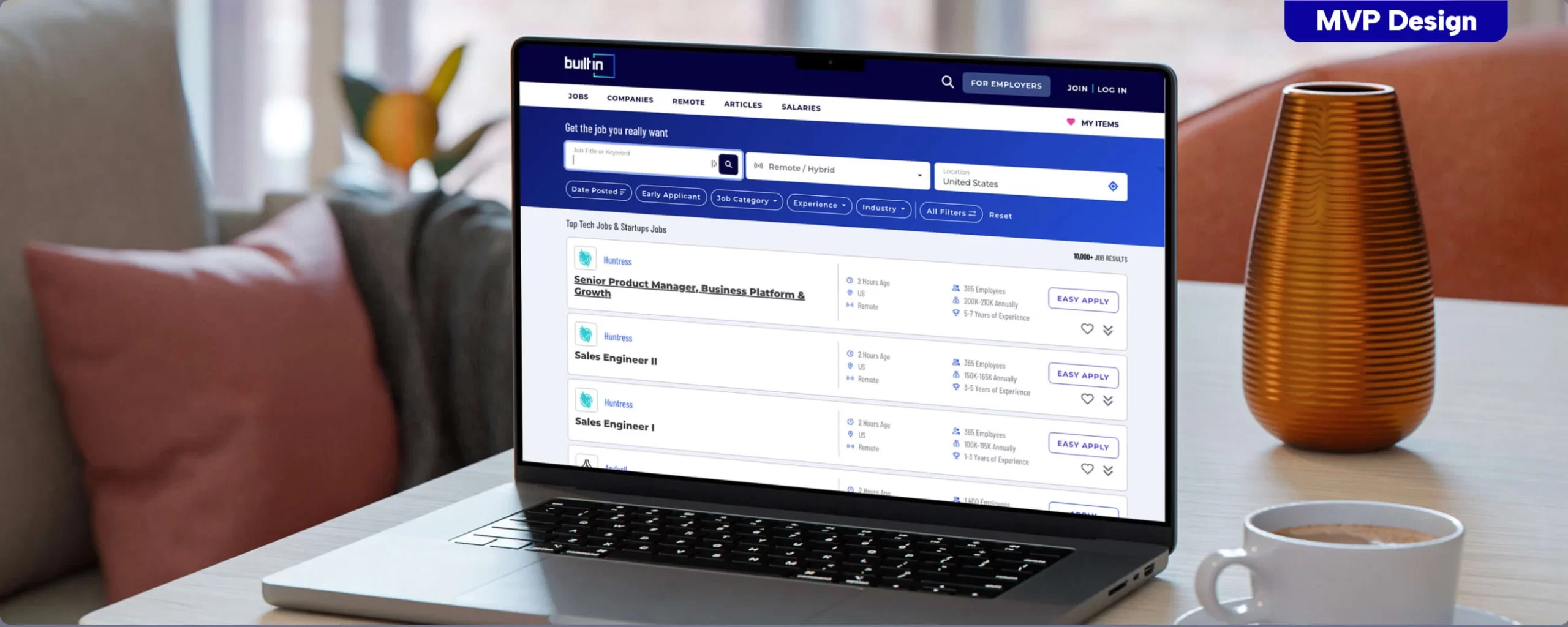
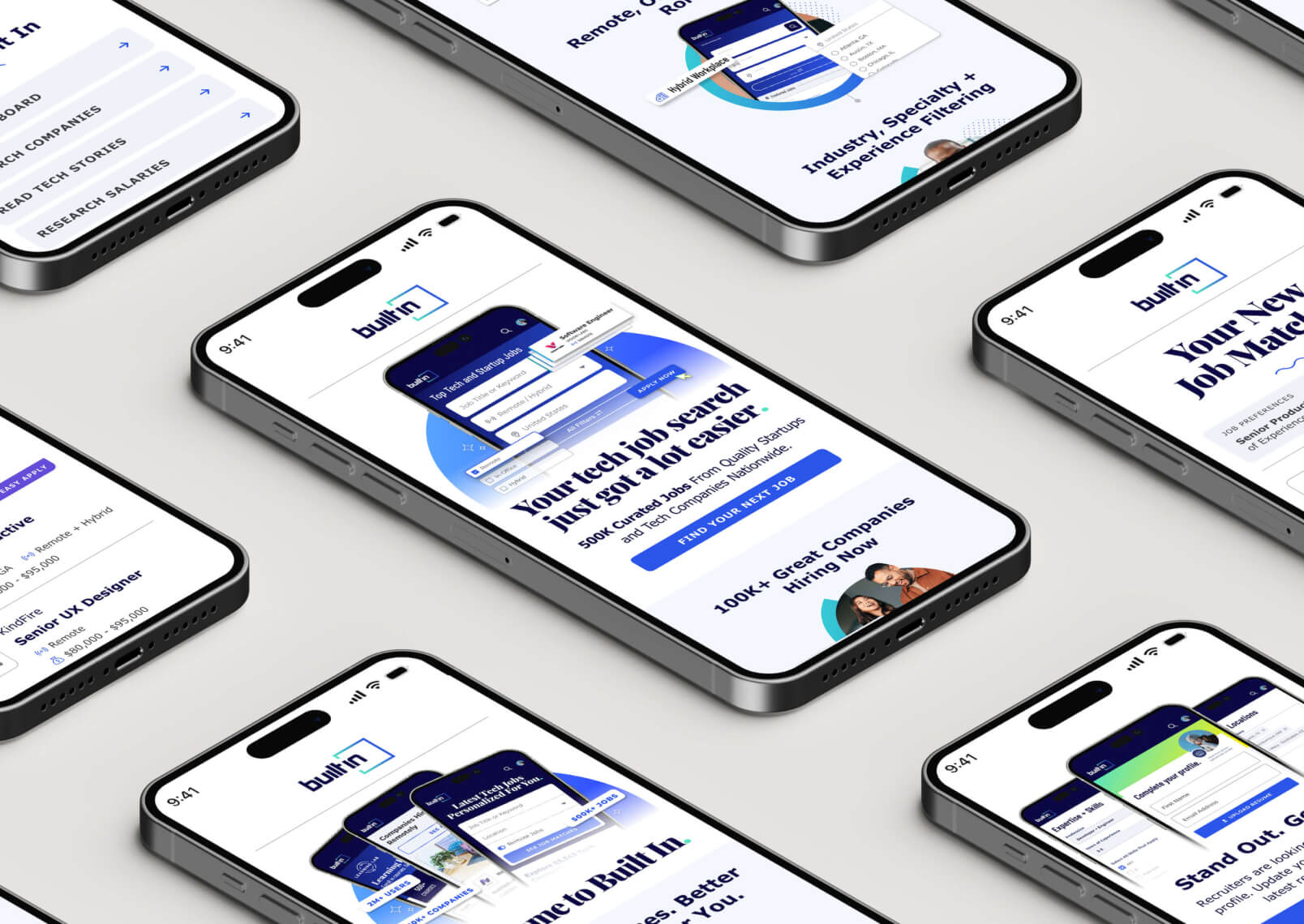
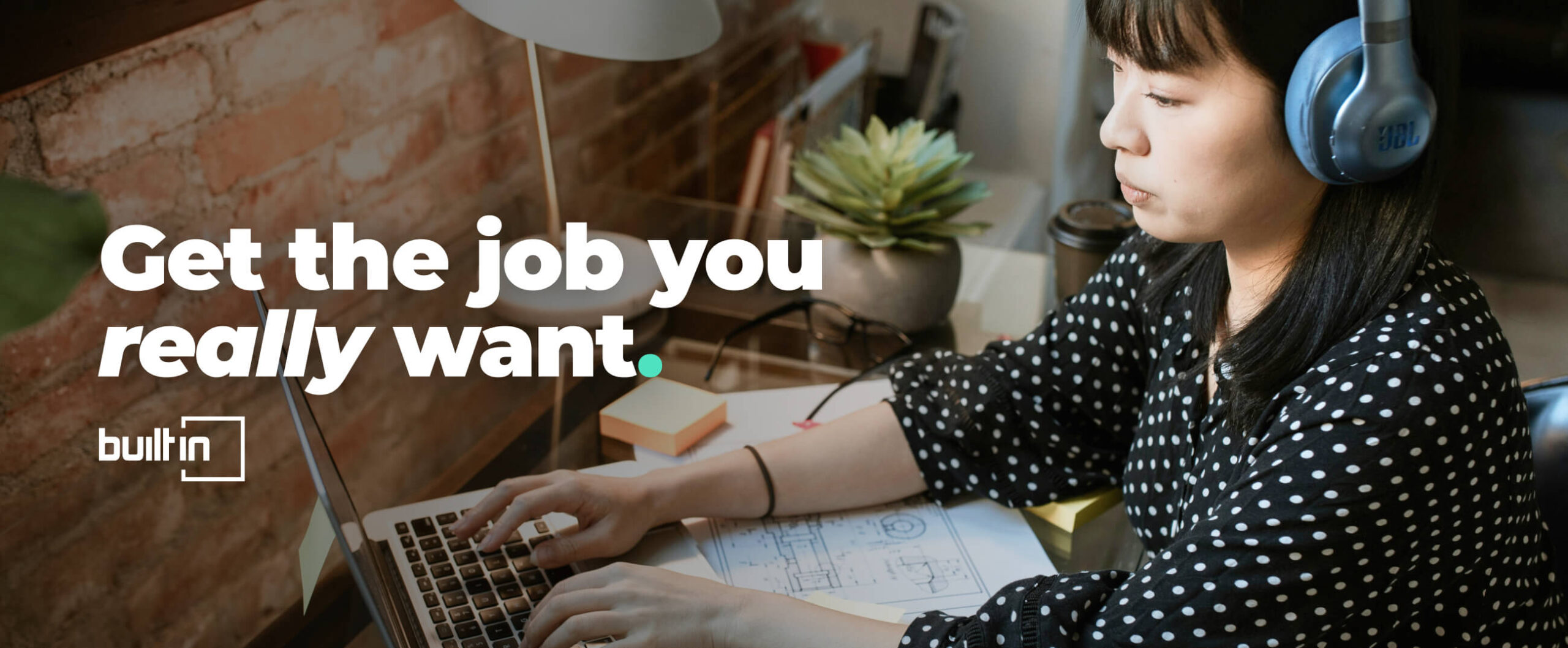
Built In is a hiring platform for tech professionals and teams, designed to make job search more personal, efficient, and engaging. As competitors like LinkedIn grow, Built In stands out by prioritizing quality matches over volume. I led the post-MVP redesign of our job board—maintaining the .NET structure to minimize dev lift—while overhauling the user experience to boost retention through clarity, personalization, and human-centered design.
My Role: Lead Designer
Deliverables:
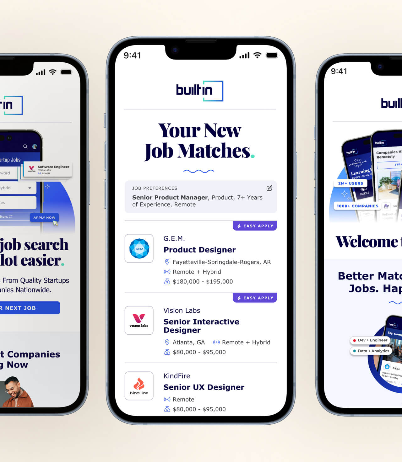
Job Board UI
User Email Campaign
Research
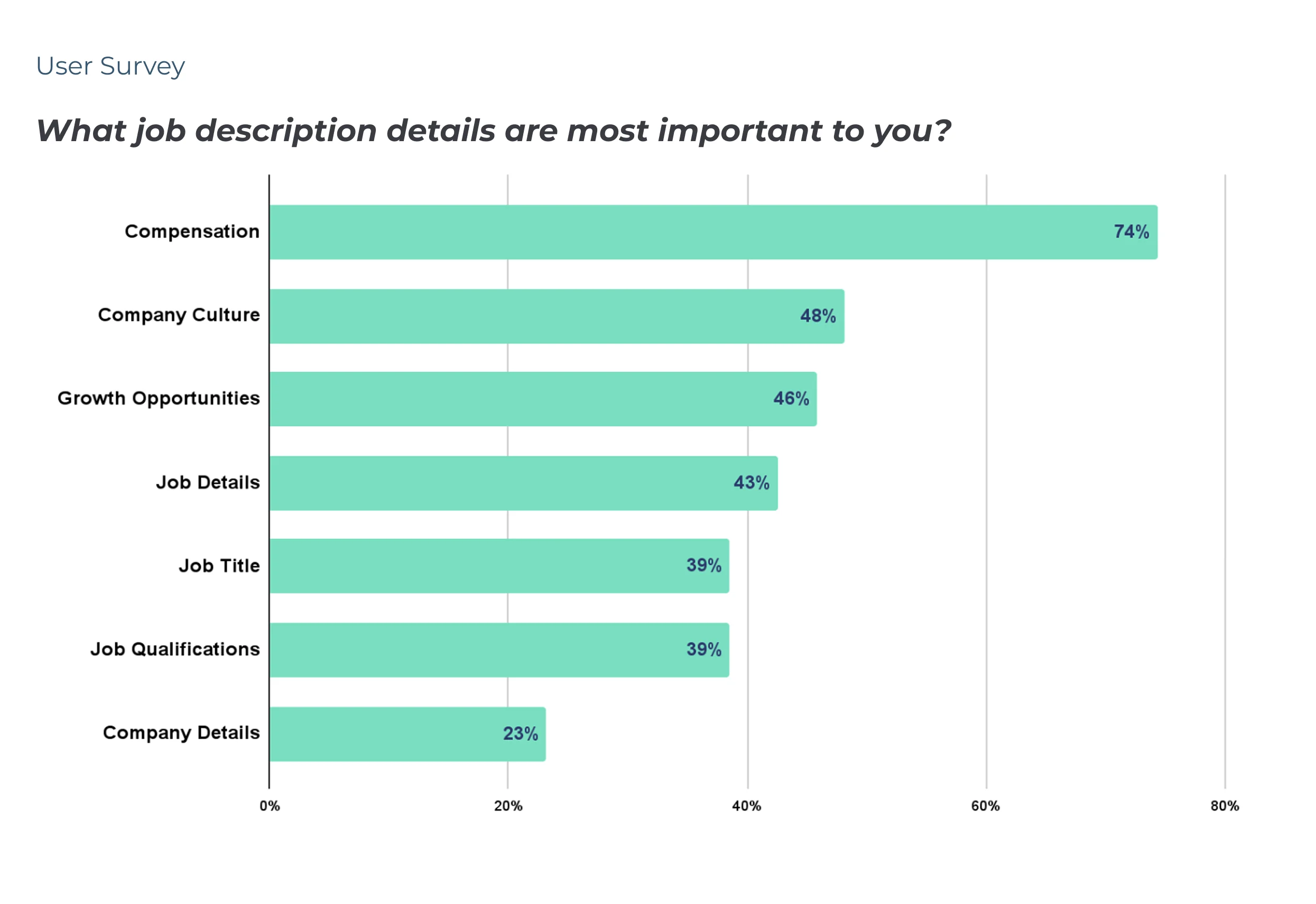
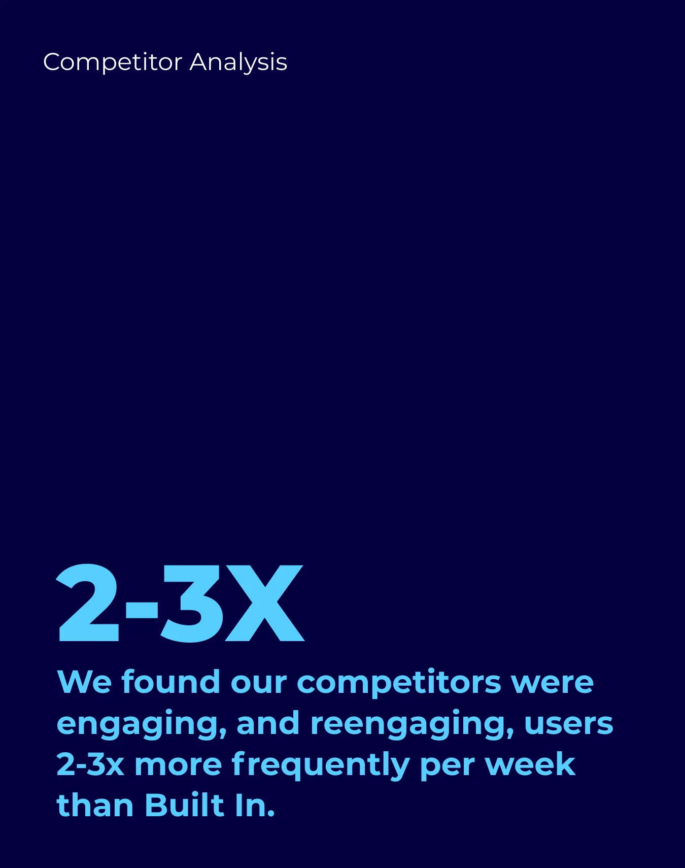
User Needs & Competitor Analysis
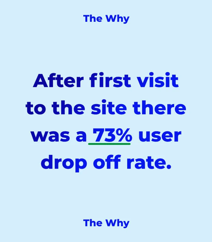
We combined user feedback, behavioral data, and competitor research to uncover the biggest friction points in the experience. From missed personalization to unclear interactions, our findings helped us focus on updates with the highest impact.
User Pain Points:
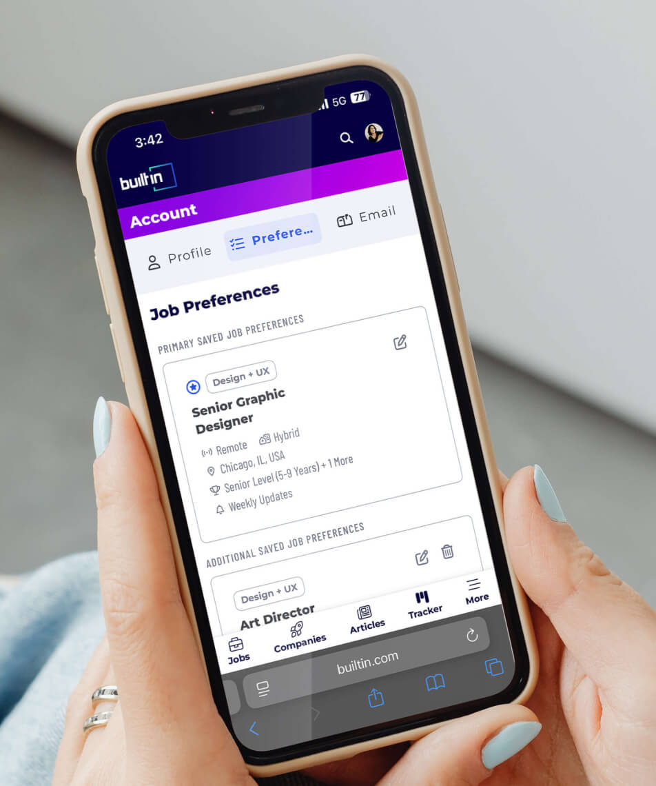
Preferences aren’t saved to come back to
No tracking of jobs already viewed or applied to
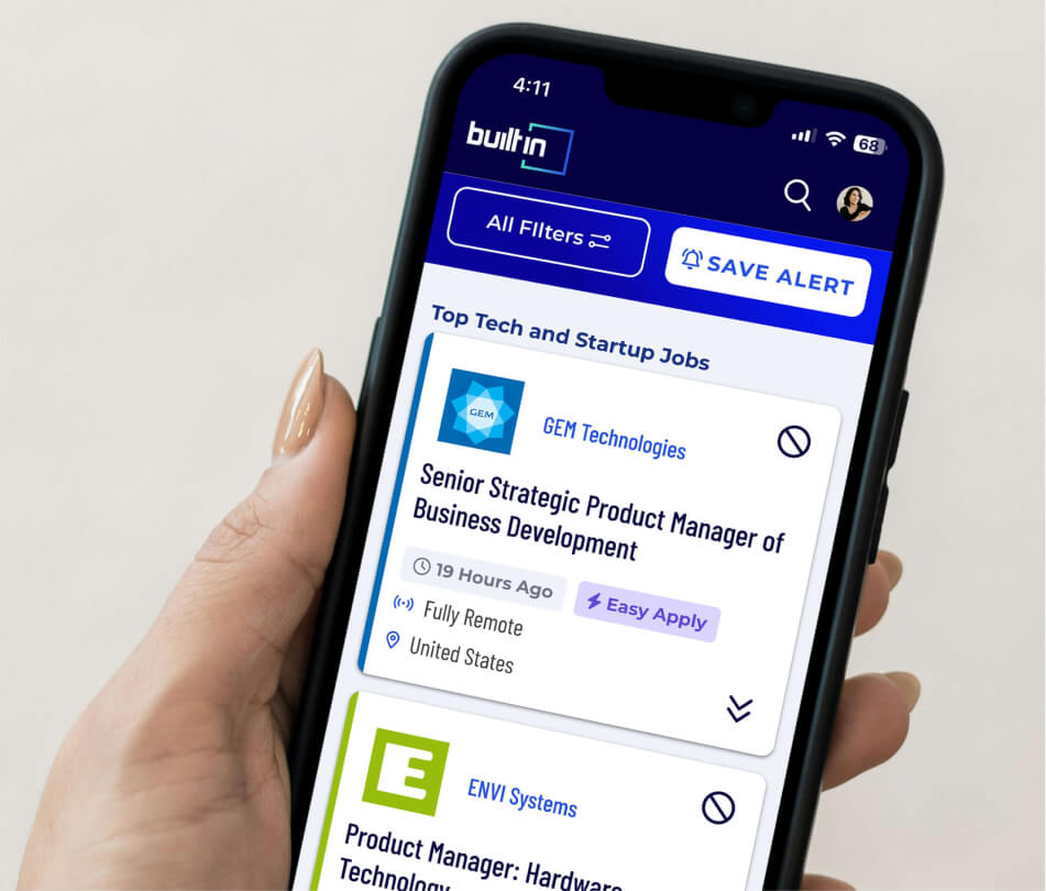
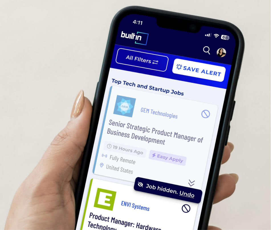
Seeing too many irrelevant jobs
Research
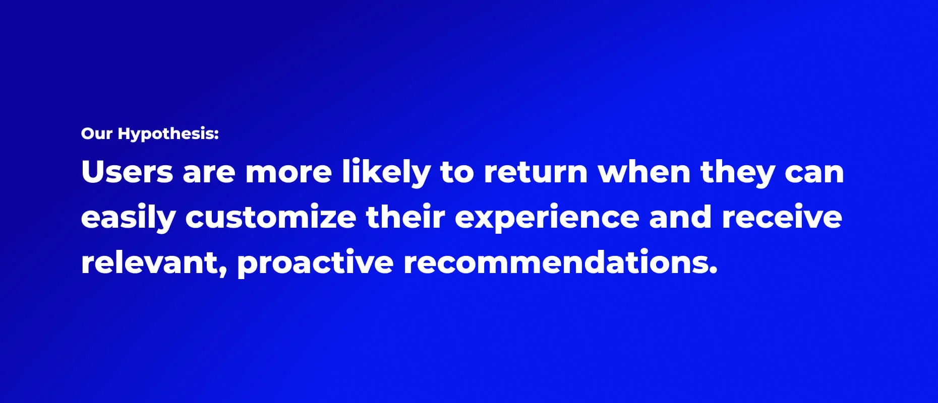
Balancing Design & Dev Time
We prioritized improvements with high user impact and low dev complexity. In this iteration we wanted to address key usability pain points while enhancing visual interest through color, microinteractions, and subtle company-specific branding. The goal: more personalization, less friction, and a friendlier job hunt.
Design Focus:
Add personality through color and company branding
Streamline job card for fast scanning
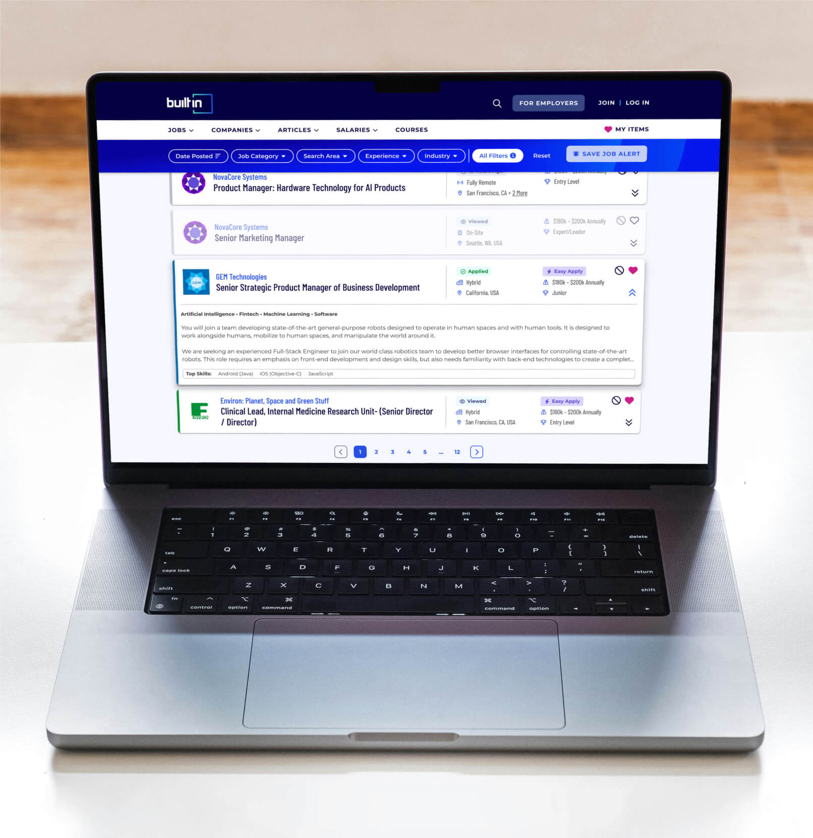
Improve filtering: saved search, save/hide jobs, and clearer filter counts
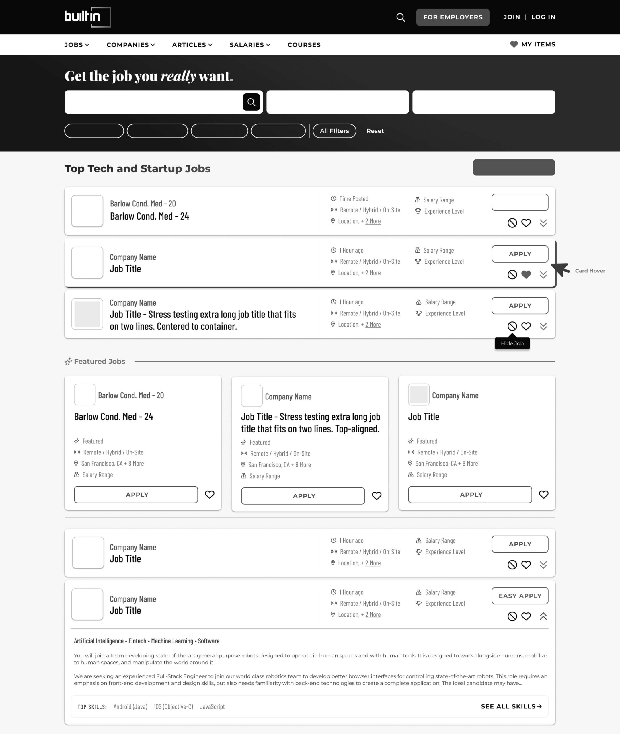
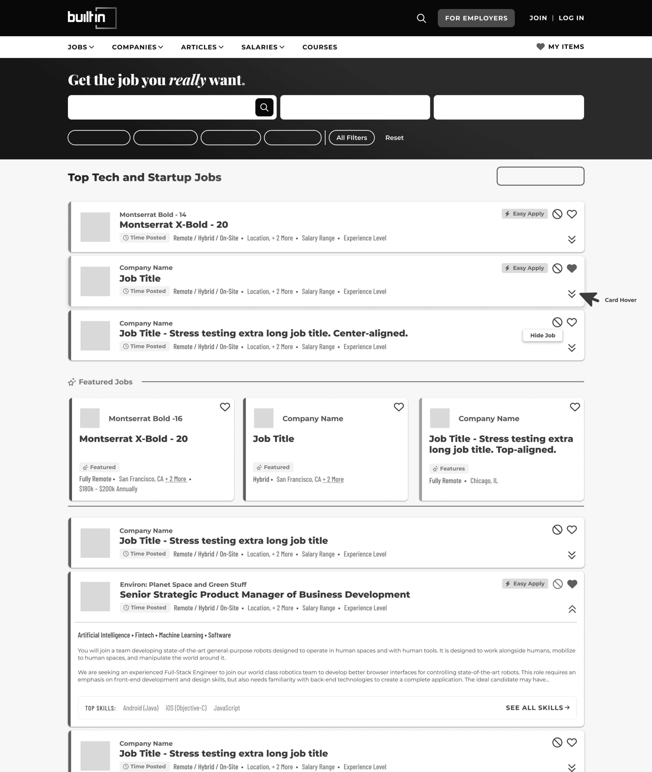
Option 1
Closest to MVP - lowest dev time
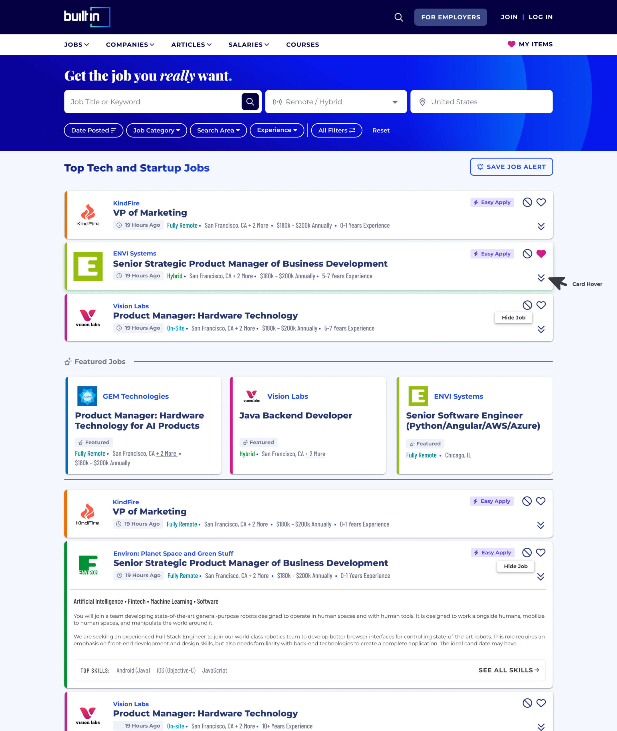
Option 2
Simplified & streamlined info
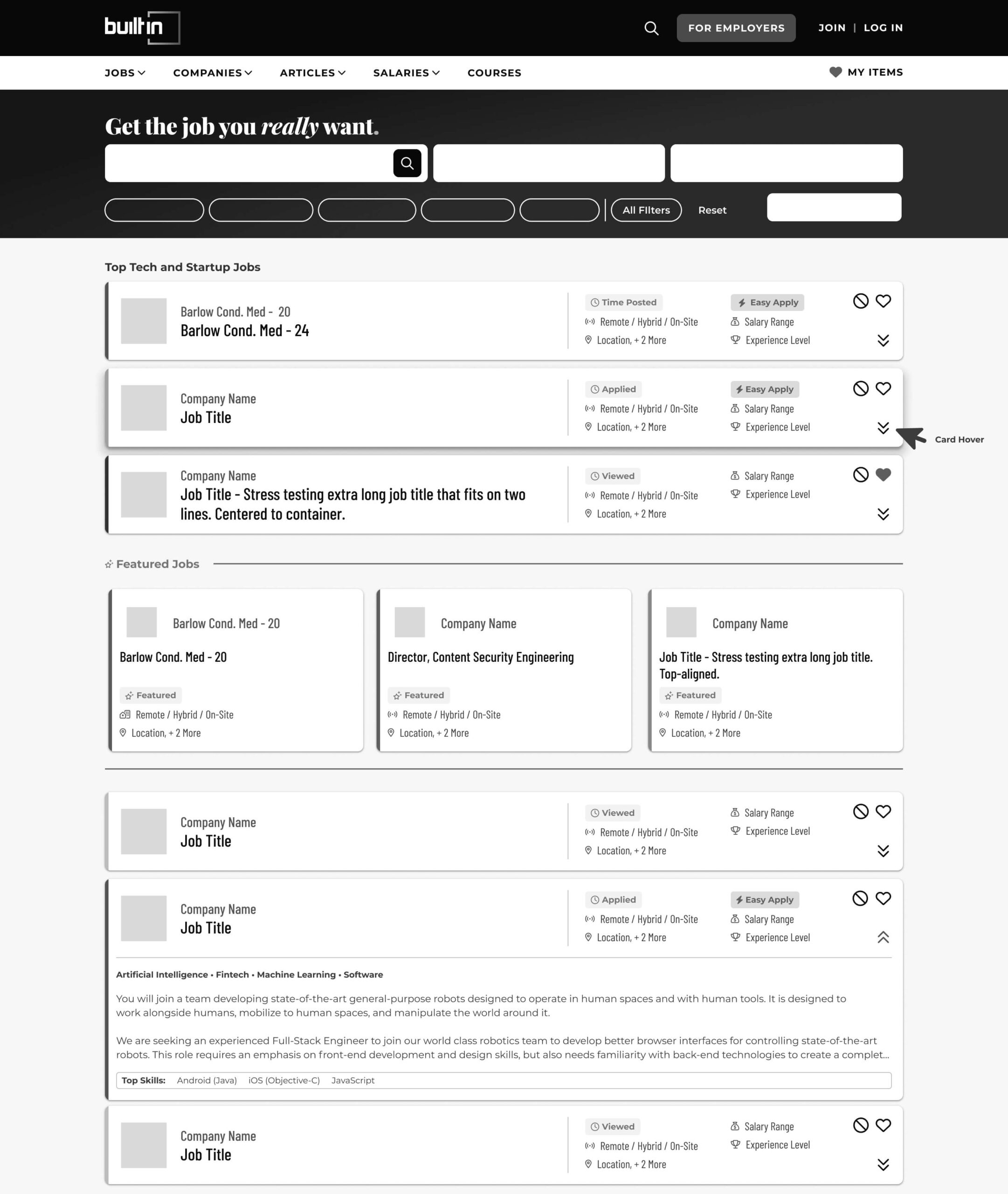
Option 3
Clickable card & custom company colors
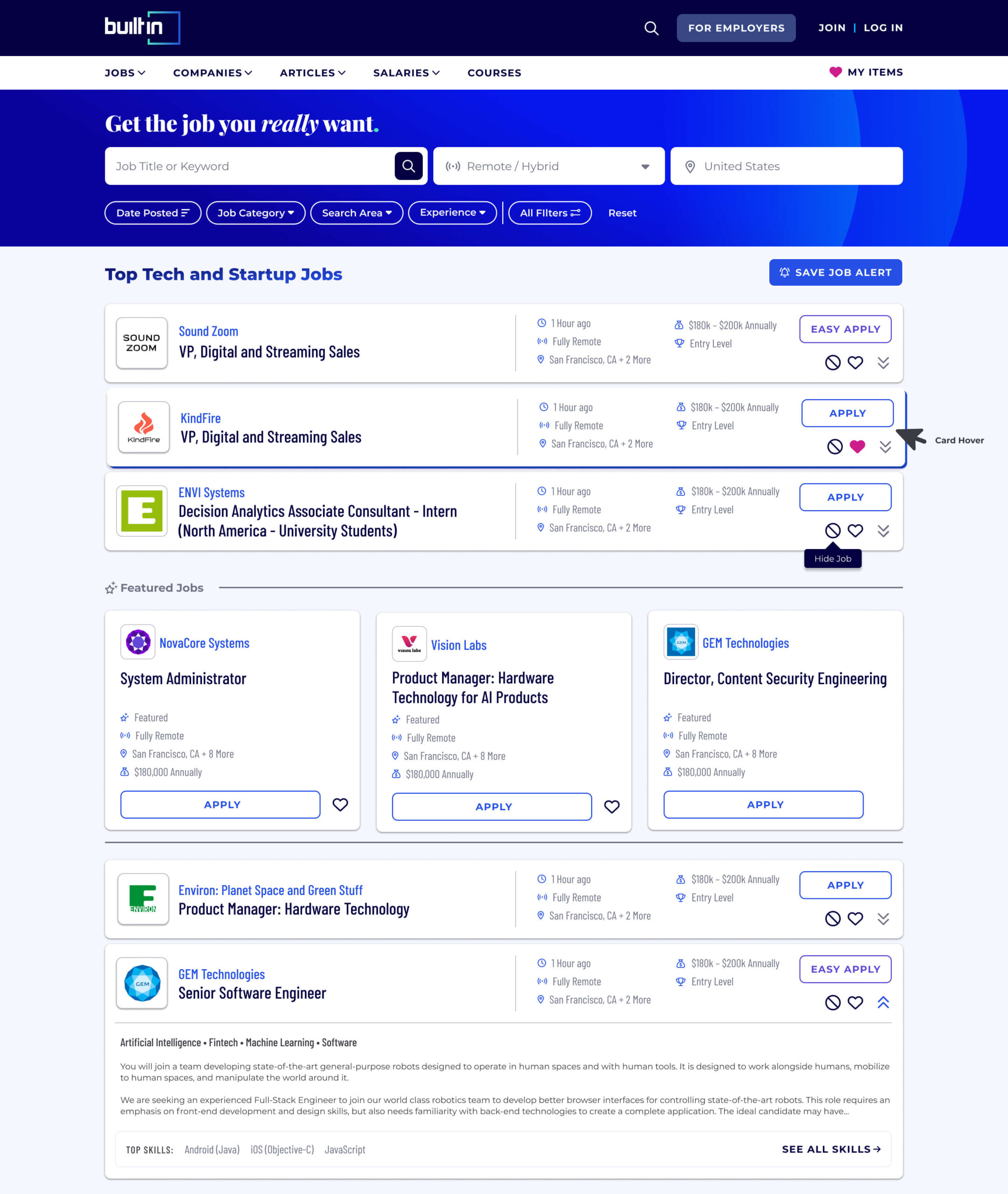
UI & Design
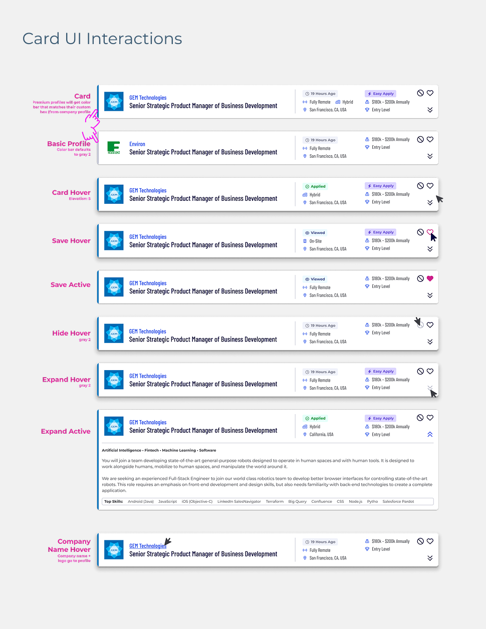
Evolving Patterns with Personality
We built on existing site components to keep the experience cohesive, while introducing fresh patterns unique to the job board. Interactions were polished with hover effects and personalized visuals. Premium companies saw their brand colors carried into job cards, boosting visibility and employer appeal.
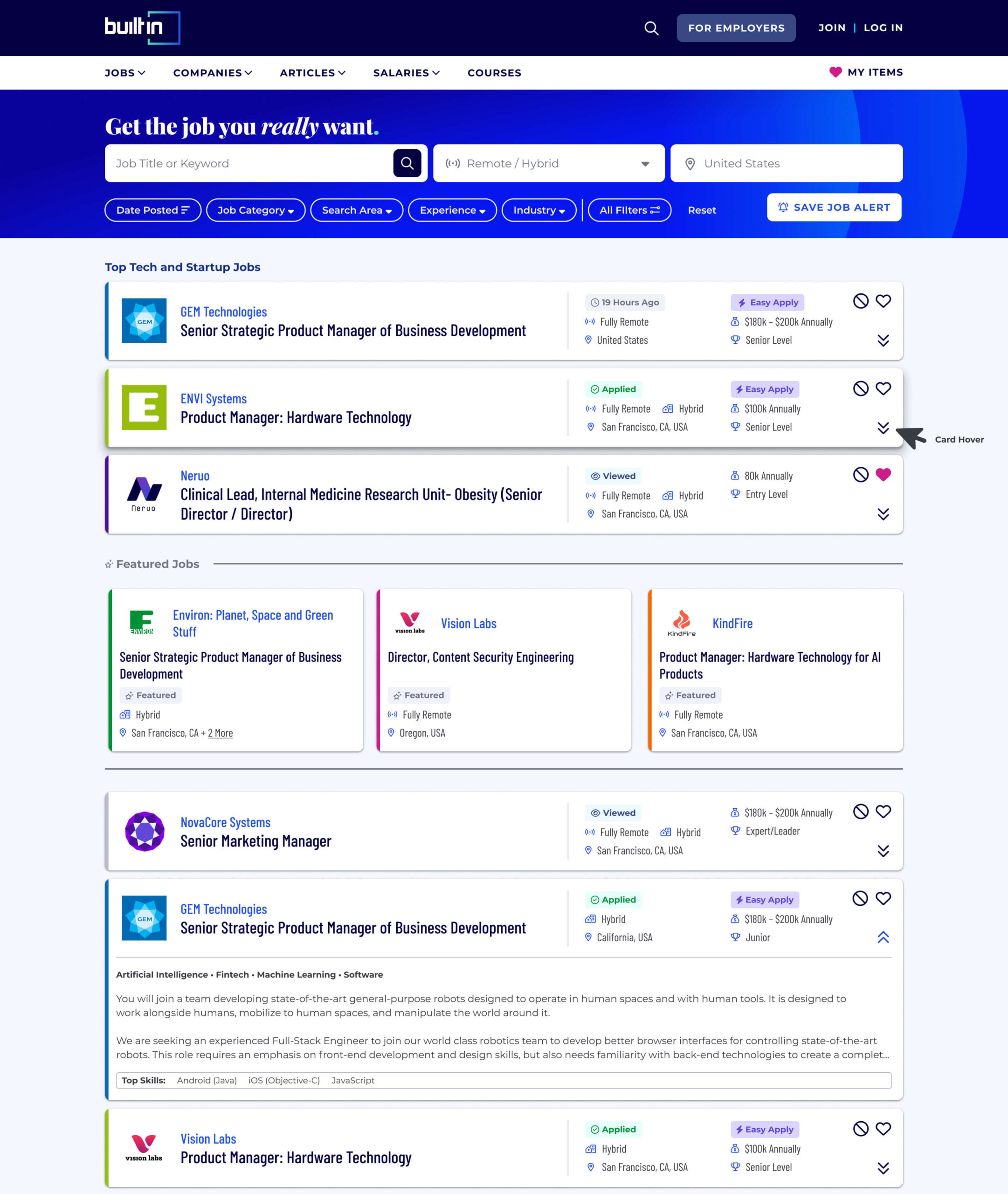
Final Design
Simple, Personalized, and Delightful
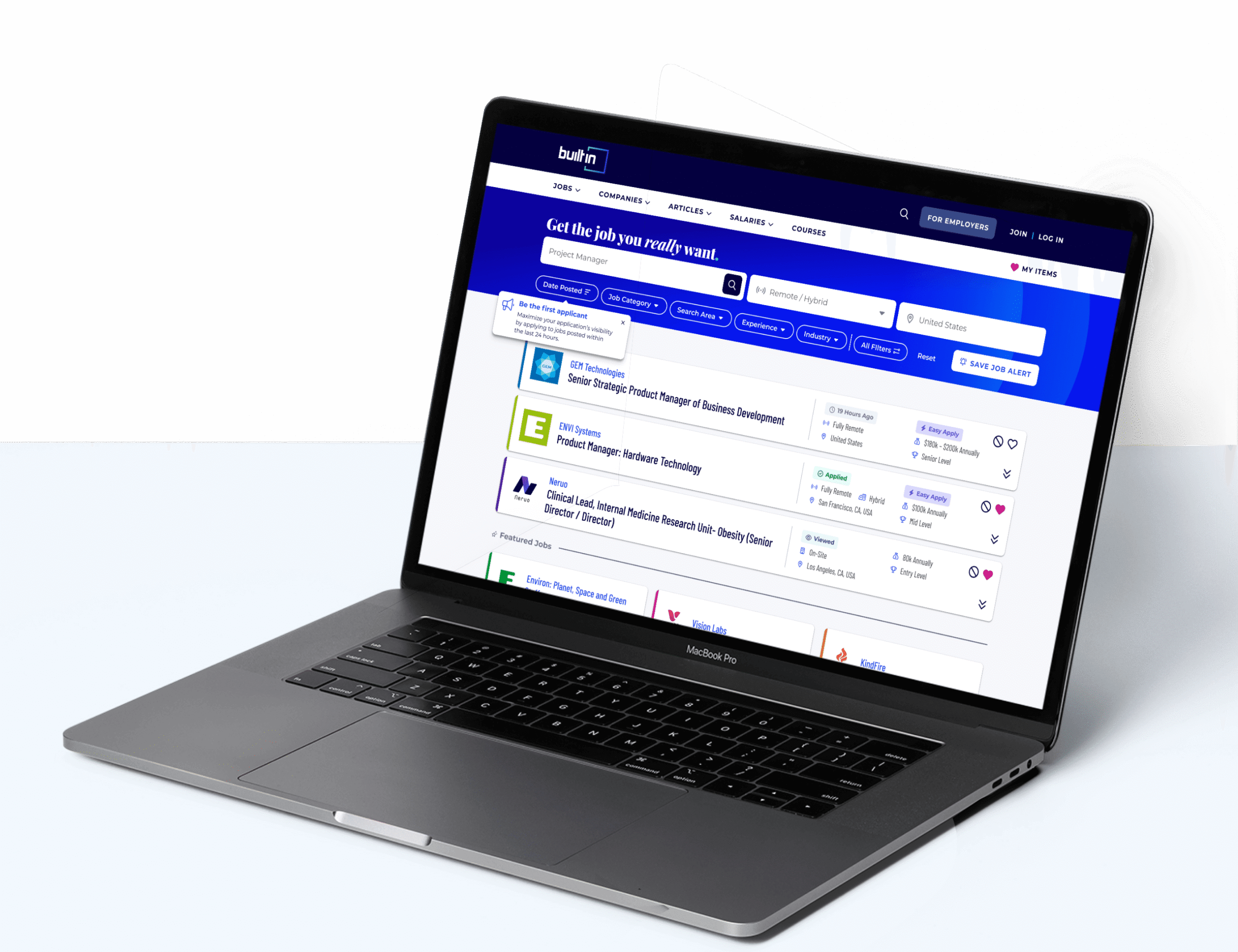
The final result was a job board that felt both refined and approachable. We removed redundant UI, clarified layout, and highlighted what matters most: job details that match user needs. With smoother filtering, stronger visual hierarchy, and thoughtful personalization, the search became less of a chore—and more of a win.
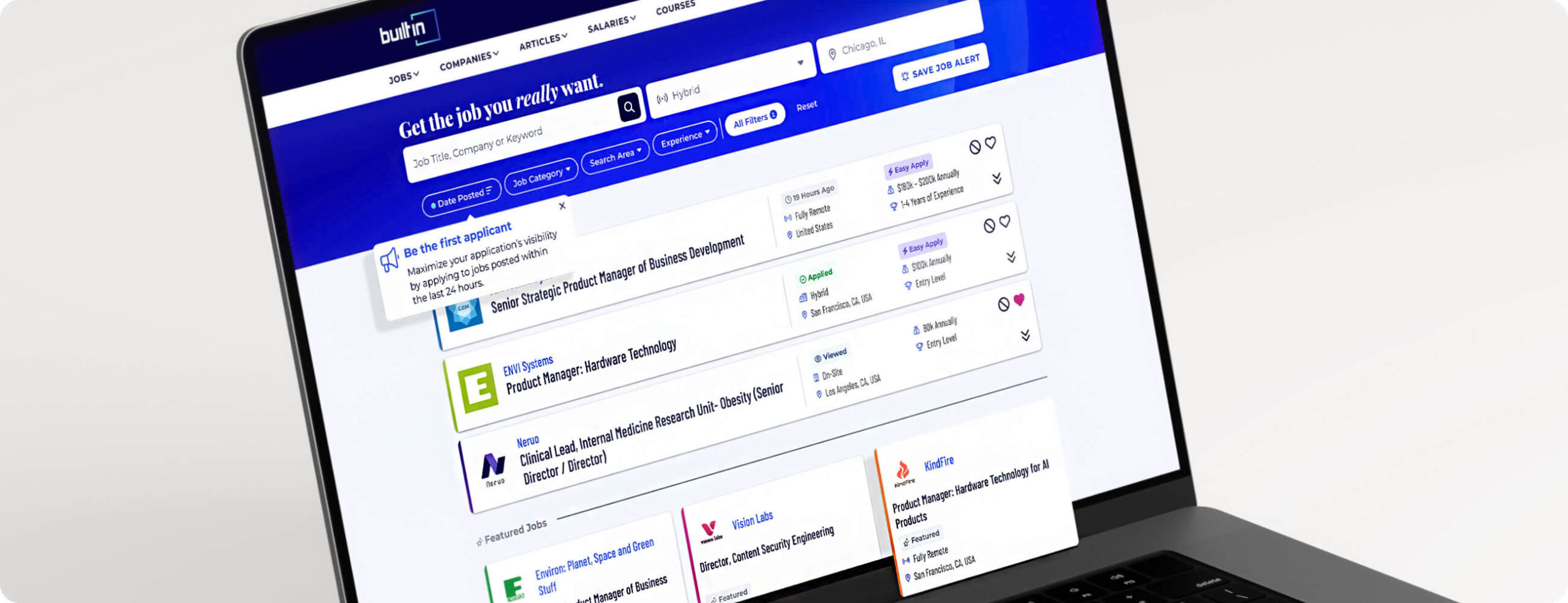
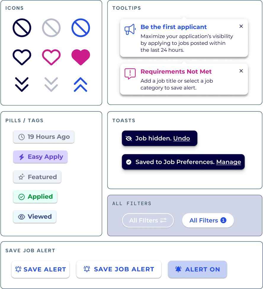
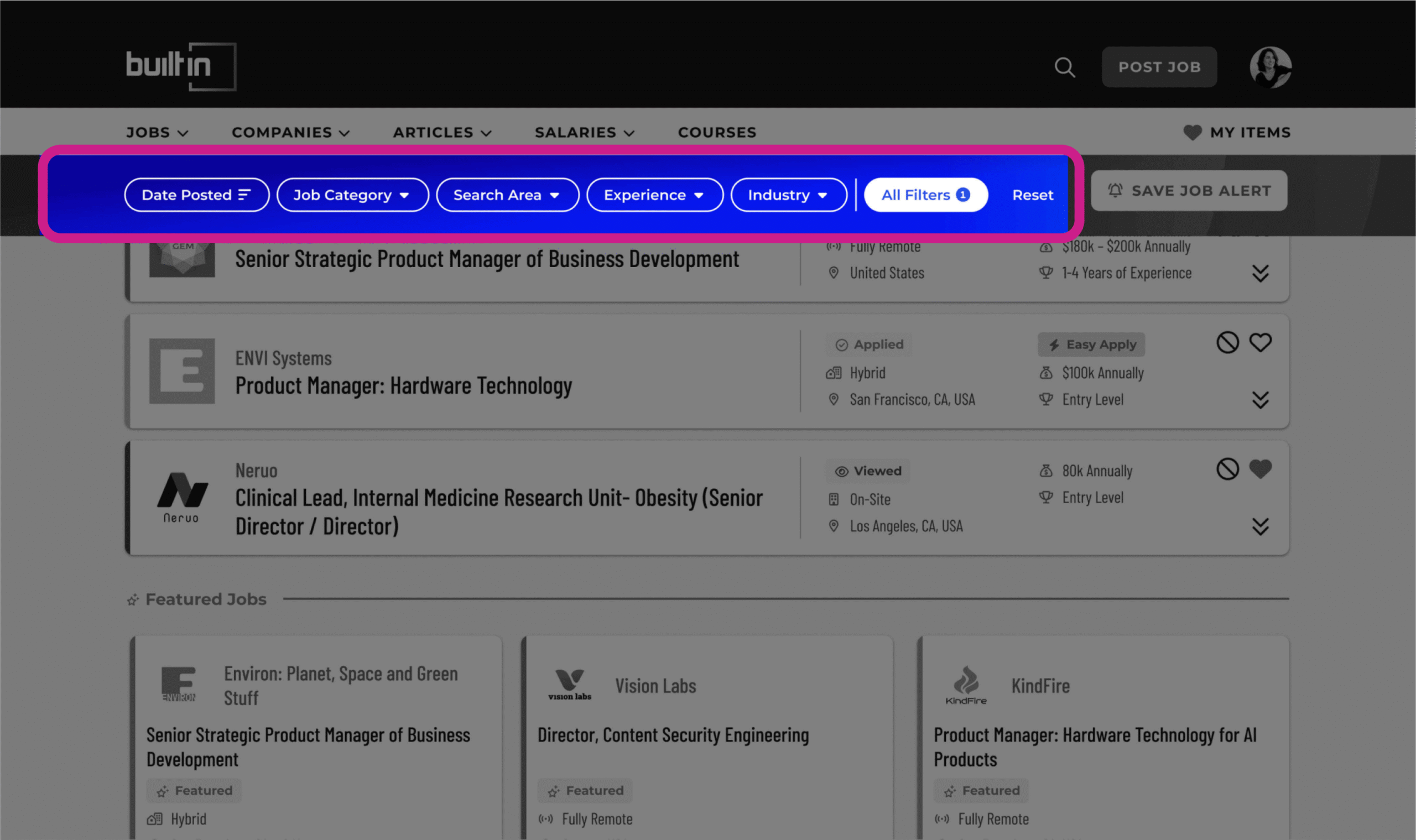
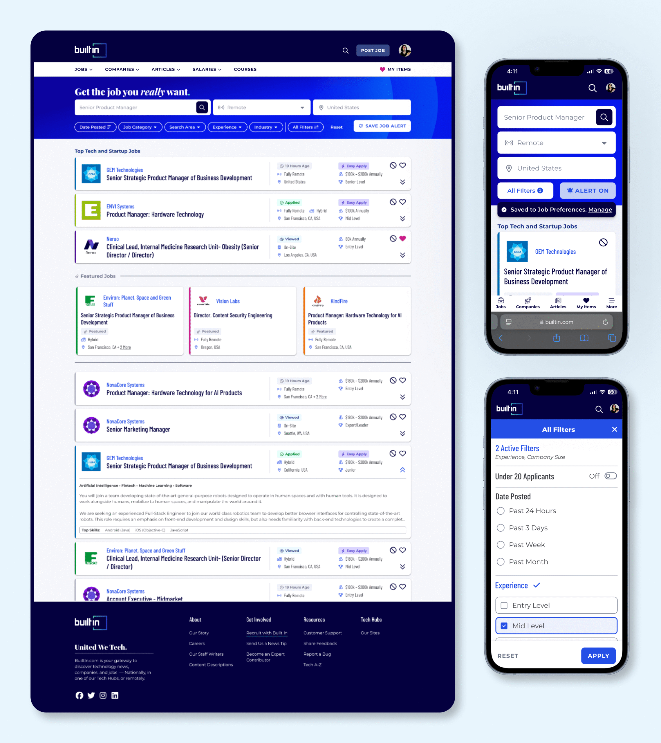
Simplified Filtering
Surfaced top filters, grouped lesser-used ones into a popover, added an “all filters” indicator, company name search, and a sticky filter nav to improve usability and reduce clutter.
Why?
Helping users focus on what matters speeds up their search and increases relevance with less friction.
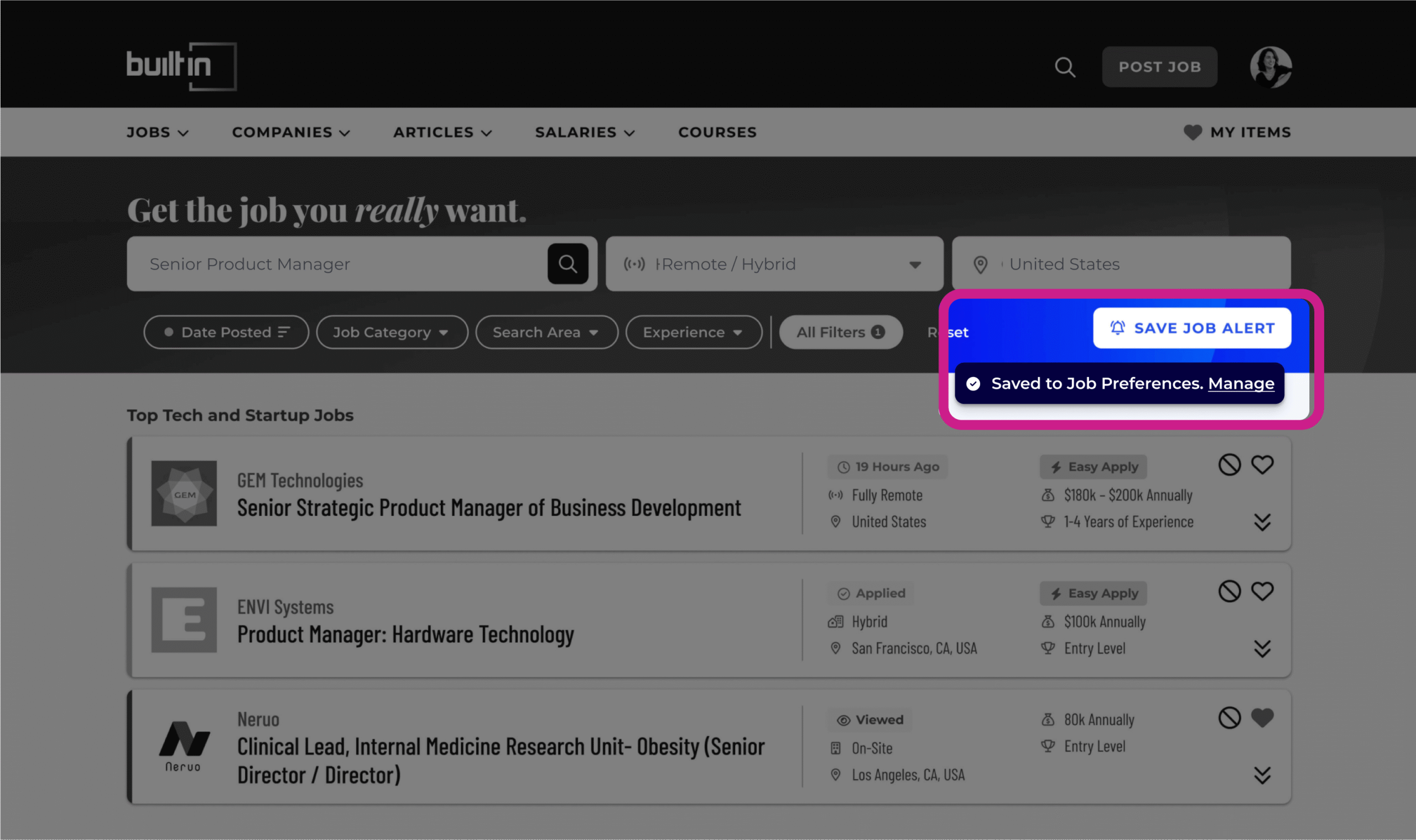
Introduced Save Job Alerts
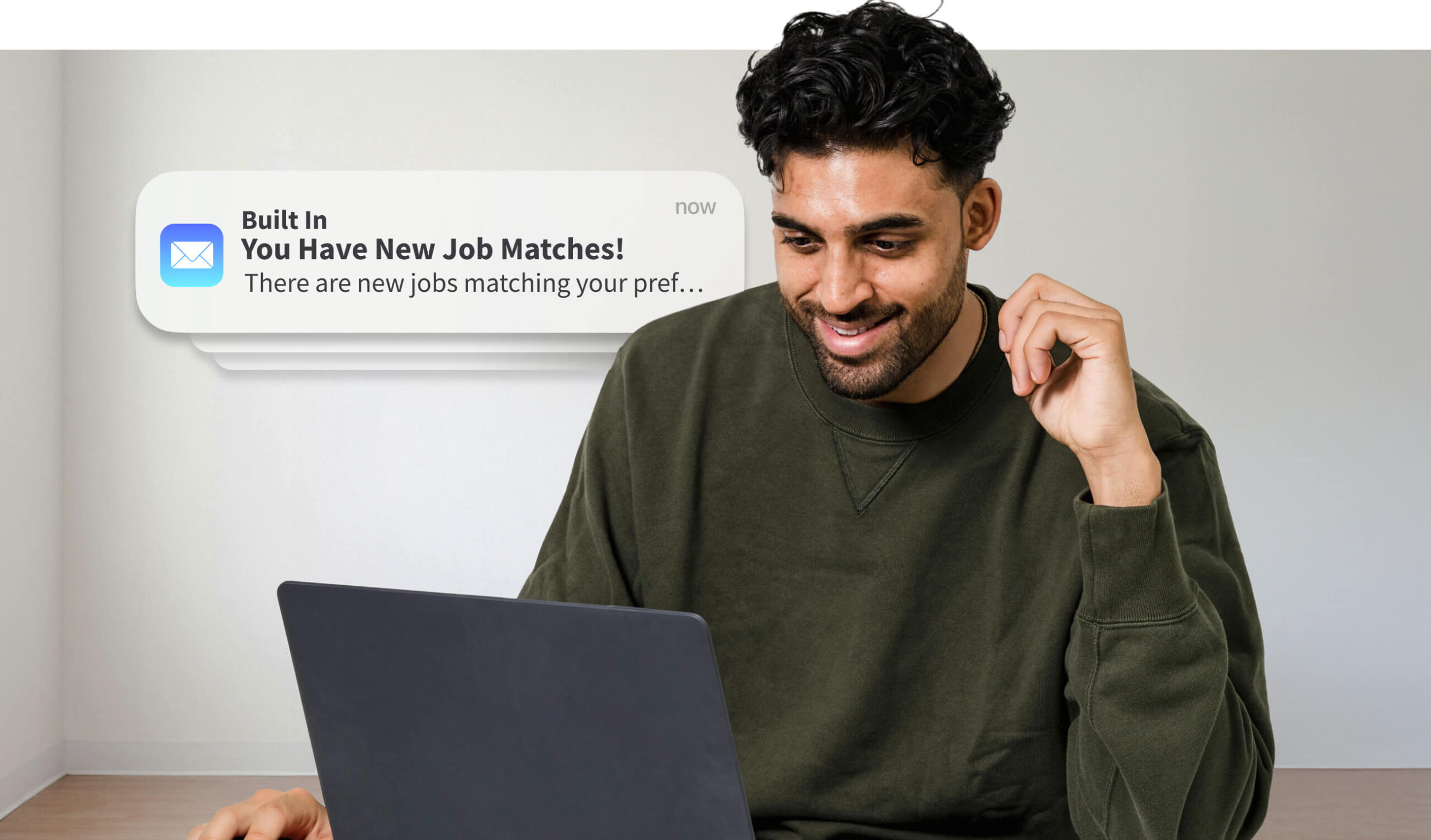
Enabled users to save preferred search filters, making it easy to pick up where they left off and revisit relevant roles in future sessions. Saved alerts also enrolled users in personalized job emails based on their criteria.
Why?
Saved searches create a more tailored experience and bring users back with higher-quality recommendations.
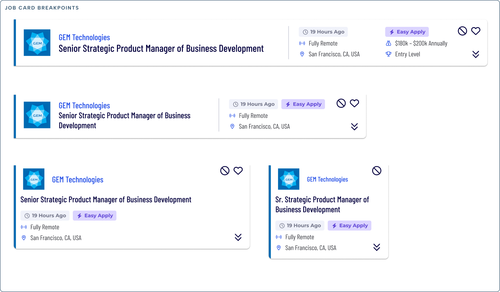
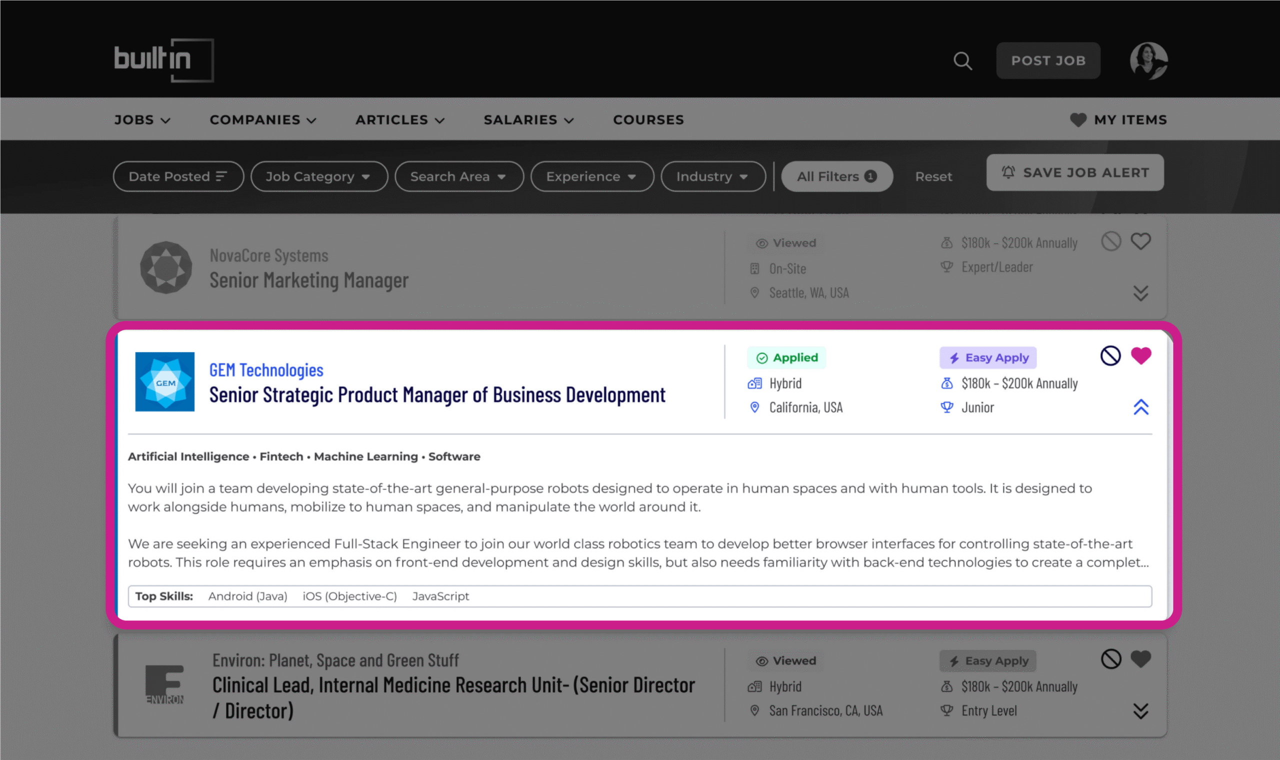
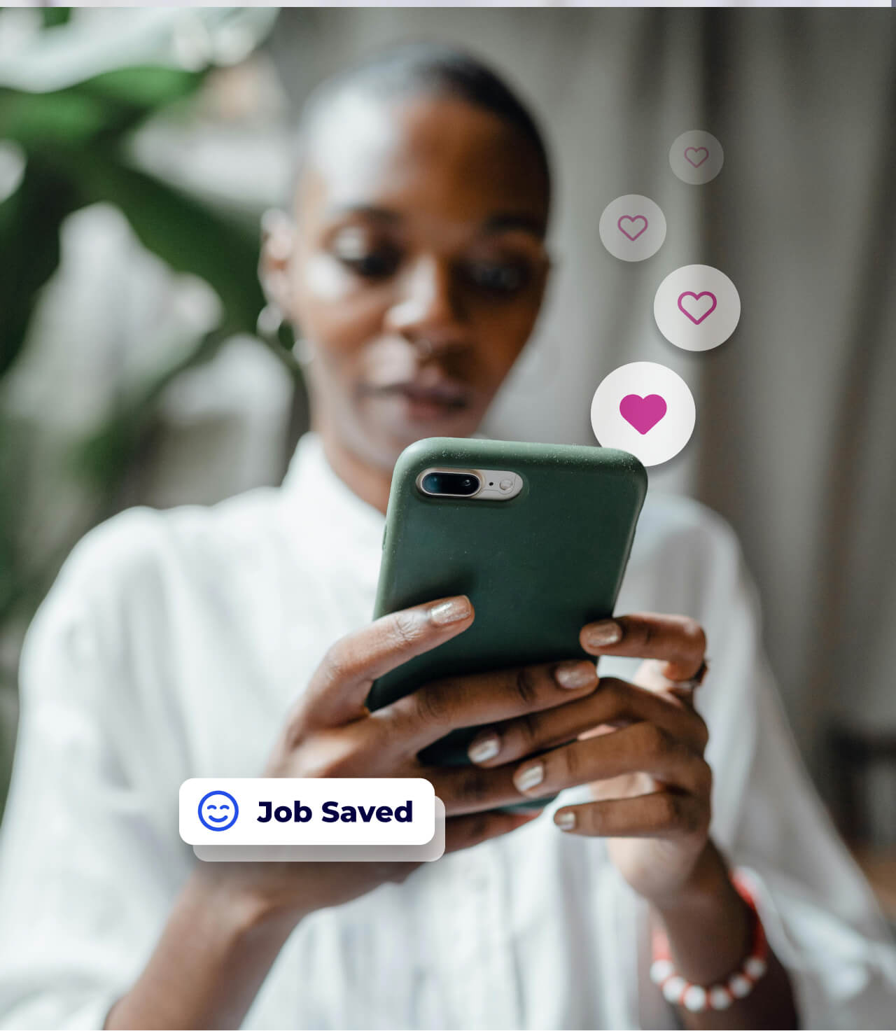
Streamlined Job Cards
Trimmed non-essential company info, prioritized job details, and added hide/save and viewed/applied indicators. Incorporated custom brand colors for premium companies to increase visibility and value.
Why?
Cleaner cards improve scan-ability for job seekers while boosting visibility for paid employer listings.